Back to School: 1st Grade Edition


Ethan starts FIRST GRADE one week from today and I just can't help but noticing how he has become this gangly little kid overnight! I swear he was just born...and now he's this big FIRST GRADER! I mean, where does the time go??

We find out who Ethan's teacher is this Friday with a little ice cream social. He's really excited to go back to school {and I am really excited for him to go back and have some structure again!}. 

Back to school shopping was always a fun event when I was in elementary school. Funny enough, I do 99% of our shopping online now so it's not quite the tradition it once was but we cannot wait to get our packages in the mail! ;)

xo natasha

The House Colors We Picked!

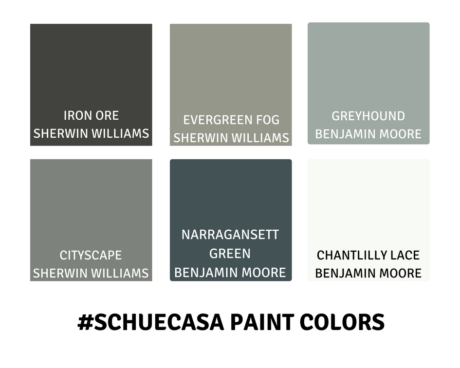
Picking out paint colors is HARD! There are literally a billion options of each shade and depending on the lighting, it can show up VERY differently in your space. That being said, we did our research and I feel really good about our choices...so I'm here to share them today!


We painted our door "Iron Ore" by Sherwin Williams. It a pretty true black with just a touch of charcoal. I like the way the matte black handle is just a shade darker too!


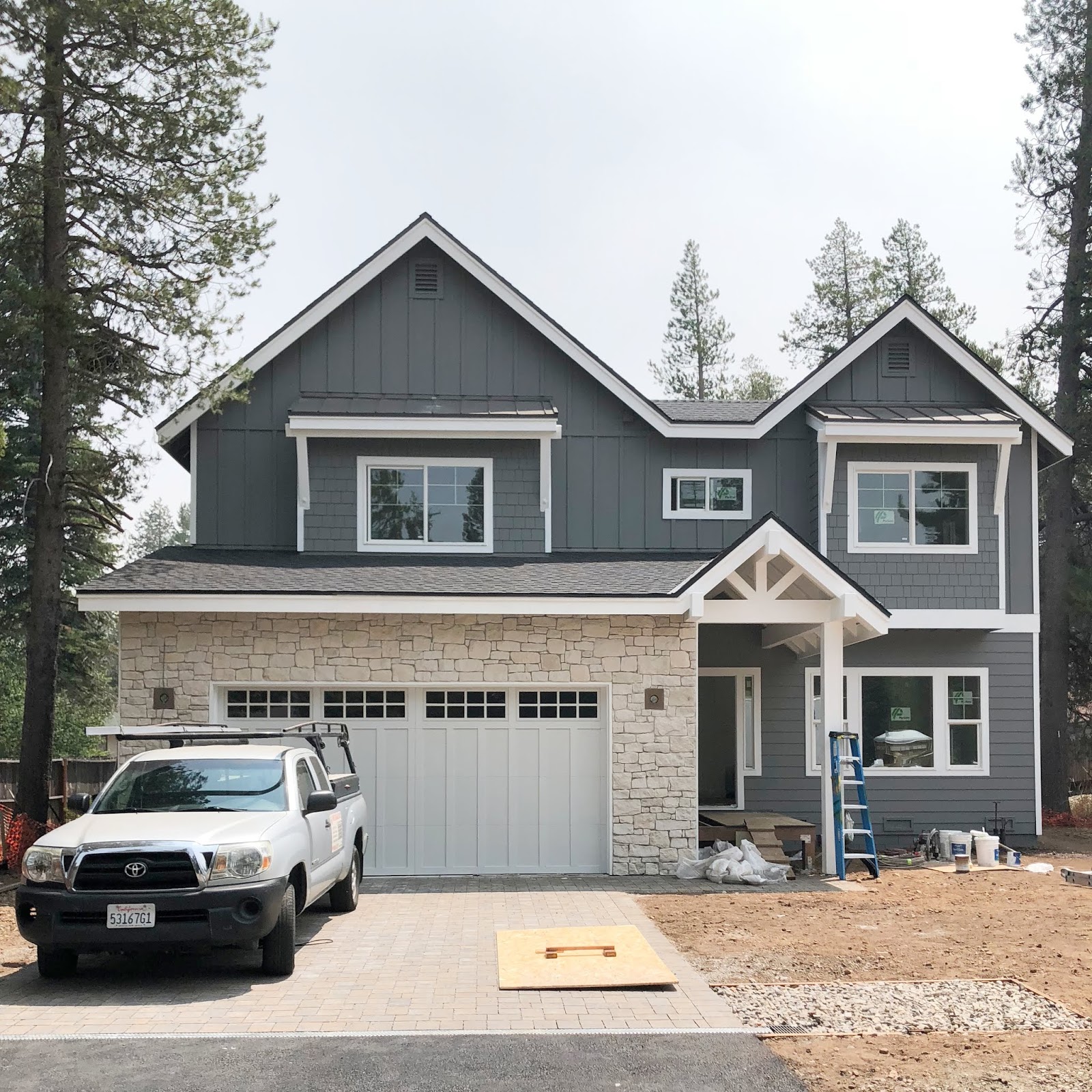
The exterior gray paint is "Cityscape" by Sherwin Williams and as I've said before, I really feel like it's a "true" gray. Not too blue, not too purple, not too brown, not too green...it's juuuuuust right! See it here in full sun... 


And at dusk! See, still looks great!


Now this is a fun, chameleon color...depending on the light, this gray {"Evergreen Fog" by Sherwin Williams} can look very green or blue, which we LOVE actually. We went with a matte paint, which is kind of risky for a kitchen 😬 but we love how it absorbs the light!


We came down to these three options. Our good friend {hi Tiara!} went with "Rare Gray" on the far right and so we knew we loved that color. "Retreat" was gorgeous too but perhaps a bit too dark/bold. So "Evergreen Fog" seemed to be the perfect medium, and still a bit of a risk for us! I'm so glad we went with it, we truly LOVE it!

More examples of how it changes with the light...


Also, the upper cabinets are "Pure White" by Sherwin Williams.


The rest of our house...including walls, trim and ceilings...are all painted "Chantilly Lace" by Benjamin Moore. I researched a lot on this color...like I said, there are a billion white choices! But I love how it turned out. And while I was worried about how it would go with the upper cabinets, they seem to compliment each other well.


Last, I picked different wall colors for the boys rooms. Wyatt's room is "Greyhound" by Benjamin Moore. The lighting wasn't great for these photos but this gray in real life has a tint of blue to it which is really pretty, but still masculine. We went with "Light French Gray" by Sherwin Williams in Wyatt's nursery {which is a great light gray if you're in the market} so I liked having something a little different in this house.


Again, sorry about the terrible lighting, but this was a really fun color for Ethan's room. It's called "Narragansett Green" by Benjamin Moore and is super rich and dramatic in person! We went with a dark gray {"Serious Gray by Sherwin Williams} in Ethan's room in our last house and loved having the darker color in there. This room is substantially bigger so we knew it could handle a darker color.

So there you have it! Hopefully this was helpful and if you have any questions, leave them in the comment section!

xo natasha

House Updates!


So sorry for the radio silence around here! We just got back from a family vacation and the house is moving at a rapid pace! I am not sure exactly what to share {if you want to see more, follow me on Instagram and check out my #schuecasa stories!} but I do want to try to document some of the process!


The exterior gray is Cityscape by Sherwin Williams, which is the perfect gray, in my opinion. It looks great in direct sunlight and also looks phenomenal in shade. So many grays can go too blue, purple, green or brown and this gray just looks very true to a dark gray.


We decided to paint the door Iron Ore by Sherwin Williams and plan to install this door handle. Some other fun choices include this doorbell button in brass, these house numbers, and this exterior light.


I am truly in love with our master bathroom. We decided to splurge a little bit here and I'm so happy with how it turned out!


Our wood floors are laminate and we really love them! They are 10 inches wide, water proof and extremely durable! They are by Mohawk, the Antique Craft line in Soft Chamois.


For our great room, which is right off the kitchen, we went with a two-story layout which helps to make the space feel much bigger and was a good compromise for going with a main floor living floor plan. Ryan is outlining where the wood mantel will go, which I am hoping will look something like this


Ah! And here is a sneak peek of our kitchen, which I am SOOO excited about! I always knew I wanted gray cabinets but was really drawn to this more green/gray color. Ryan wasn't as sure, at first, but we're really happy with how they turned out We ultimately decided to go with with white upper cabinets to keep the space light and airy.

Here are some details:

Cabinet Lower Color is Evergreen Fog by Sherwin Williams
Cabinbet Upper Color is Pure White by Sherwin Williams
Wall Color is Chantilly Lace by Benjamin Moore 


The hardware was a hard choice! We ultimately decided to go with these pulls {in various sizes, depending on the drawer size} and these knobs. The backsplash is a herringbone tile with white grout...and I love it! Inexpensive, but classic!


The downstairs bathroom will serve as the main floor bathroom as well as the guest bathroom {hooray for having guests again!}. Here is what we chose for this room:


There are so many more details to share but hey, this is a start! I hope to plan more, including an overview of the floor plan.

Happy Monday!
xo natasha